600true
thumbnails
under
450true
false
800https://www.kelseyphoenix.com/wp-content/plugins/thethe-image-slider/style/skins/frame-white
-
4000
fade
false
60
bottom
0
-
4000
fade
false
60
bottom
0
-
4000
fade
false
60
bottom
0
-
4000
fade
false
60
bottom
0
-
4000
fade
false
60
bottom
0
-
4000
fade
false
60
bottom
0

-
4000
fade
false
60
bottom
0

-
4000
fade
false
60
bottom
0
-
4000
fade
false
60
bottom
0
-
4000
fade
false
60
bottom
0
-
4000
fade
false
60
bottom
0
-
400
fade
false
60
bottom
0
-
4000
fade
false
60
bottom
0
-
4000
fade
false
60
bottom
0
-
4000
fade
false
60
bottom
0
-
4000
fade
false
60
bottom
0
-
4000
fade
false
60
bottom
0
A group project centered around designing the look, feel and layout of an iPad dessert magazine, this piece is the culmination of two months of mood boards, layout iteration, typography studies and even baking the featured dessert.
The magazine displays full page layouts prominently featuring dessert photography to entice readers to cook the accompanying recipes. A clean, minimalistic design supported by the bold color scheme, which mirrors the apples, pears and oranges of the recipes, unifies the pages into a singular magazine known as à la mode.
[full size pdf]More about my particular pages can be found below.

I was tasked to create the magazine cover, featured article cover and section pages. These layouts would hold the magazine together, unifying recipes of a singular fruit into sections, allowing the recipes to stand alone on separate pages and yet still be contained within the larger article.
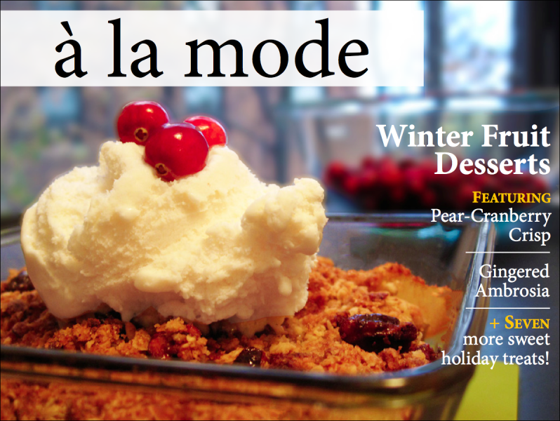
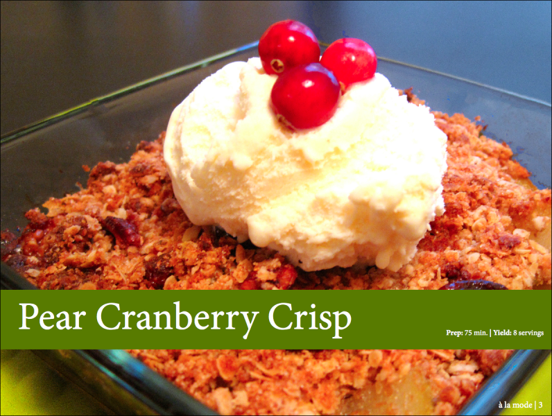
The magazine cover features a close-up image of a dessert that we baked ourselves to entice readers to peruse the magazine.
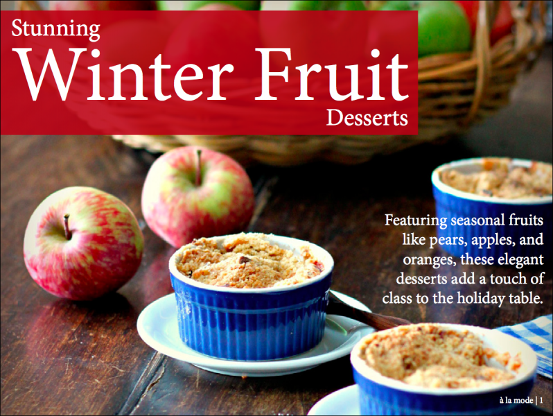
With Winter Fruit Desserts as the major article of the magazine, a fitting introductory page was necessary. With a very filled with love, home cooked feel to the image, a warm red was chosen as the colored accent. This contrasts well with the blue ramekins in the photograph
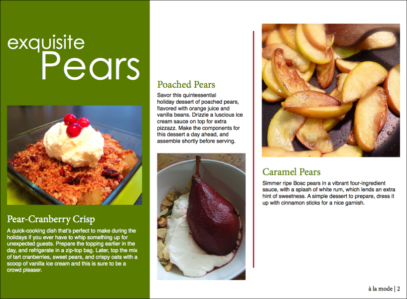
A singular page to preface the three pear recipes. With a deep green to mirror the pear, this three column layout shows the final product of each of the recipes as well as a short description, enticing the reader to read further into the article.
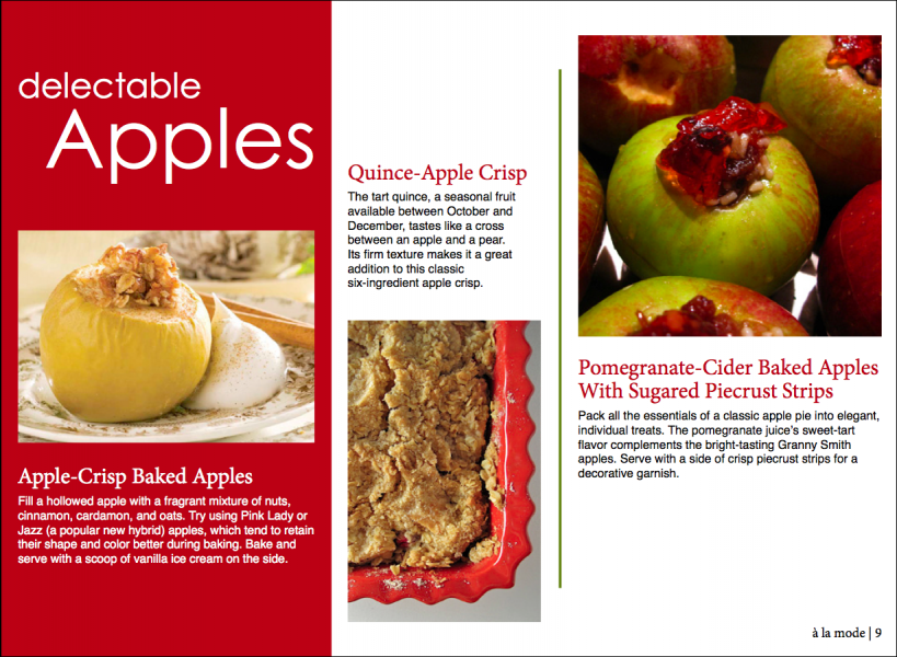
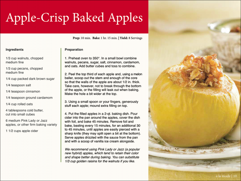
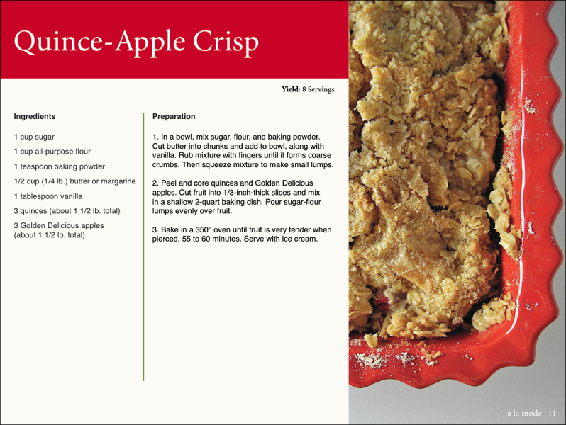
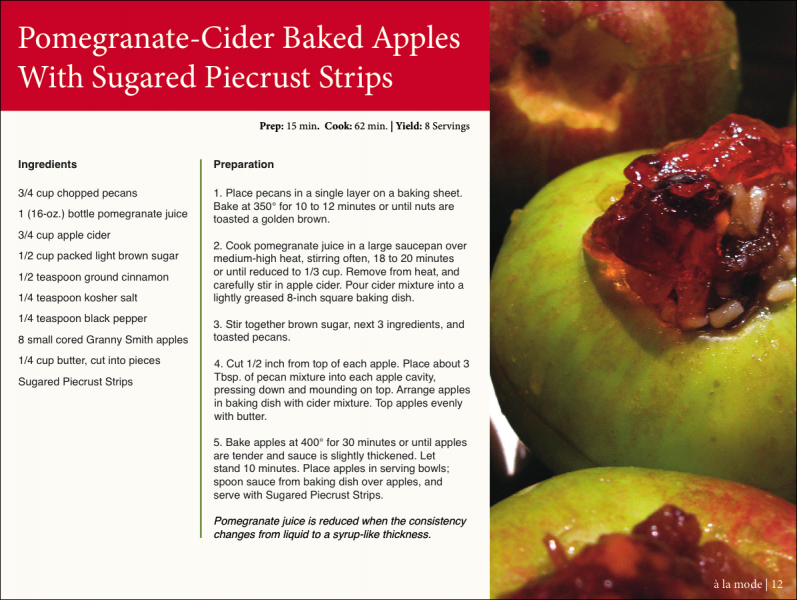
A similar page to the above, now for the three apple recipes. With the deep red found in the recipe names, this use of color leads the eye across the page, and enforces a hierarchy among the text.
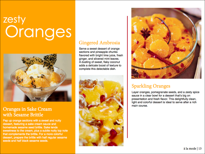
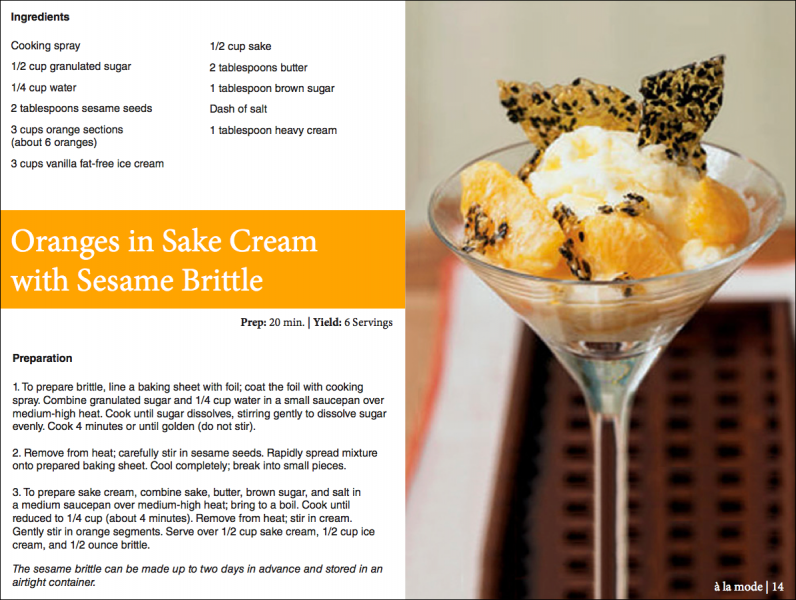
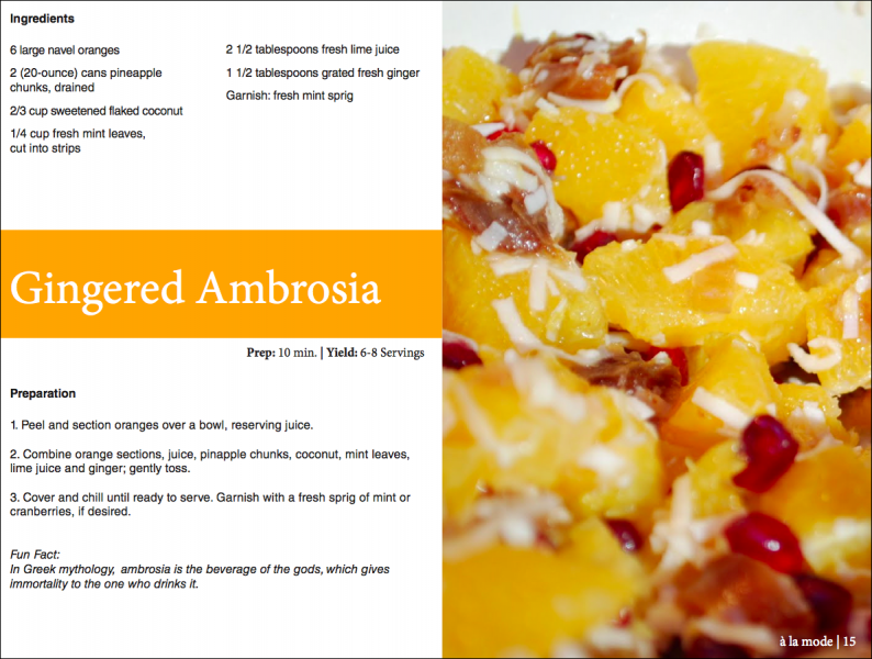
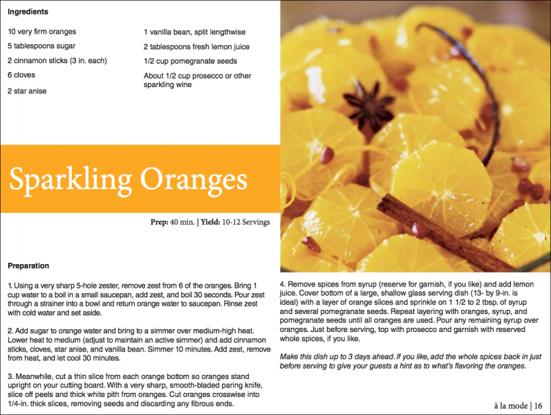
The final section of the Winter Fruit Desserts article features oranges. A bright tangy yellow-orange color spices up the color scheme and brings a lively end to the collection of recipes.