445true
thumbnails
under
344true
true
800https://www.kelseyphoenix.com/wp-content/plugins/thethe-image-slider/style/skins/frame-white
-
5000
fade
false
60
bottom
0
-
5000
fade
false
60
bottom
0
-
5000
fade
false
60
bottom
0
-
5000
fade
false
60
bottom
0
In a group of three, we were tasked to design a mobile app that would be useful to commuters.
After performing interviews with commuters, brainstorming concept ideas, and iterating upon the design, we arrived at Flow, a crowd-sourced public transit commuter app. The app would gamify the daily commute with points, badges, and physical rewards. With a simplified interface and low barrier to entry, users would be able to passively contribute data and help Flow users.
One of our main inspirations was the app Tiramisu, which while helpful at times, lacked the strong user base that would be able to provide accurate transportation data. Two weaknesses of Tiramisu are the barrier to entry and lack of incentive to contribute data, problems that we attempted to solve with the automation of data sharing features and the use of both physical and virtual rewards.
Please read below for a more in depth look at the design process of Flow.


Research:After completing 9 interviews with public transit commuters, we found that they had two main concerns, knowing bus locations and bus capacity. Our interviewees often said that the resources that they utilized were inaccurate and unreliable and desired a tool that would help them locate buses at a specific time. They wanted to be able to avoid crowded buses and get a seat after a long day of school/work. To organize these ideas, I created this diagram that groups our findings into interrelated categories.
Personas:Drawing from the data we created personas that embodied prospective users. Using these personas as driving forces, we’d be able to target the app more precisely and ensure that what we were creating would be something people would use.
Brainstorming:We then brainstormed ideas that would target the interviewees’ main concerns in an app that is fun to use. We focused on different techniques of gamification and different types of reward systems. Mapping the ideas on an impact-achievability grid, we were able to pinpoint our strongest design ideas. We then took those and began to combine them together into a single, cohesive app.
Design Considerations:We also focused on the shortcomings of the Tiramisu app and made sure to design Flow to be better. In this diagram, I have depicted the origin of Flow app features and shown how this app is an improvement of Tiramisu. Flow design solutions were generated with multiple considerations in mind, as illustrated with the color coded connections.
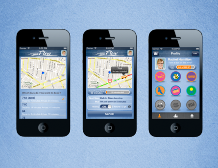
Wireframes:Next we made wireframes for the screen-by-screen interaction. Here, are a few wireframes that I created to use in initial user testing. During the testing, we asked real users about their experience “using” this app. Drawing from the feedback, we were able to iterate upon our idea to make the app simpler, more intuitive, and overall more fun to use.
Logo Design:I then was in charge of the visuals in the app. To us, Flow meant a smooth commute, one that meant our app users would feel more relaxed and at ease when using our app. To design the logo, I started with a more hand drawn, flowing aesthetic. With the ambiguity of the context of ‘flow’ I wanted to include a bus somewhere in the logo. Integrating the bus with the name itself resulted in a more fluid feel.
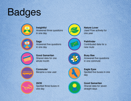
Design Aesthetic:As a part of our app, we have a virtual badge reward system for when users contribute to the general pool of knowledge. This will help encourage users to input more data into the central transportation info database. Here, I have created badges for various scenarios of data sharing and support for Flow. We wanted them to be fun and playful so the color palette chosen is bright and colorful with.
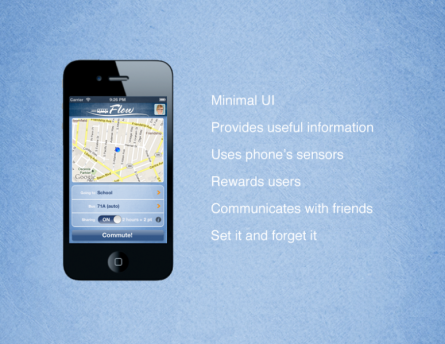
After multiple iterations of designs, our tech lead programmed our app for the iPhone. He arrived at the above screenflow which is based upon the initial wireframes, design considerations, and features that we discussed and came together on as a group.